
3 weeks to go and Finalising my Pieces!
With less than 3 weeks to go I am certainly feeling the pressure of deadline: mainly because of the added pressure of preparing everything I’d want to be printed on fabric and other materials. The fabric printing deadline for hand-in is next Tuesday the 12th May which I discovered today and the textiles technician at uni isn’t accepting any more files to print until Thursday so Thursday is my target to have my fabric printed imagery sorted by and Tuesday at the very latest if I want to receive it by the actual day of hand in which is quite scary…
In the meantime, since my review last week I have been focusing on a couple of things:
Finalising my imagery to be printed on fabric
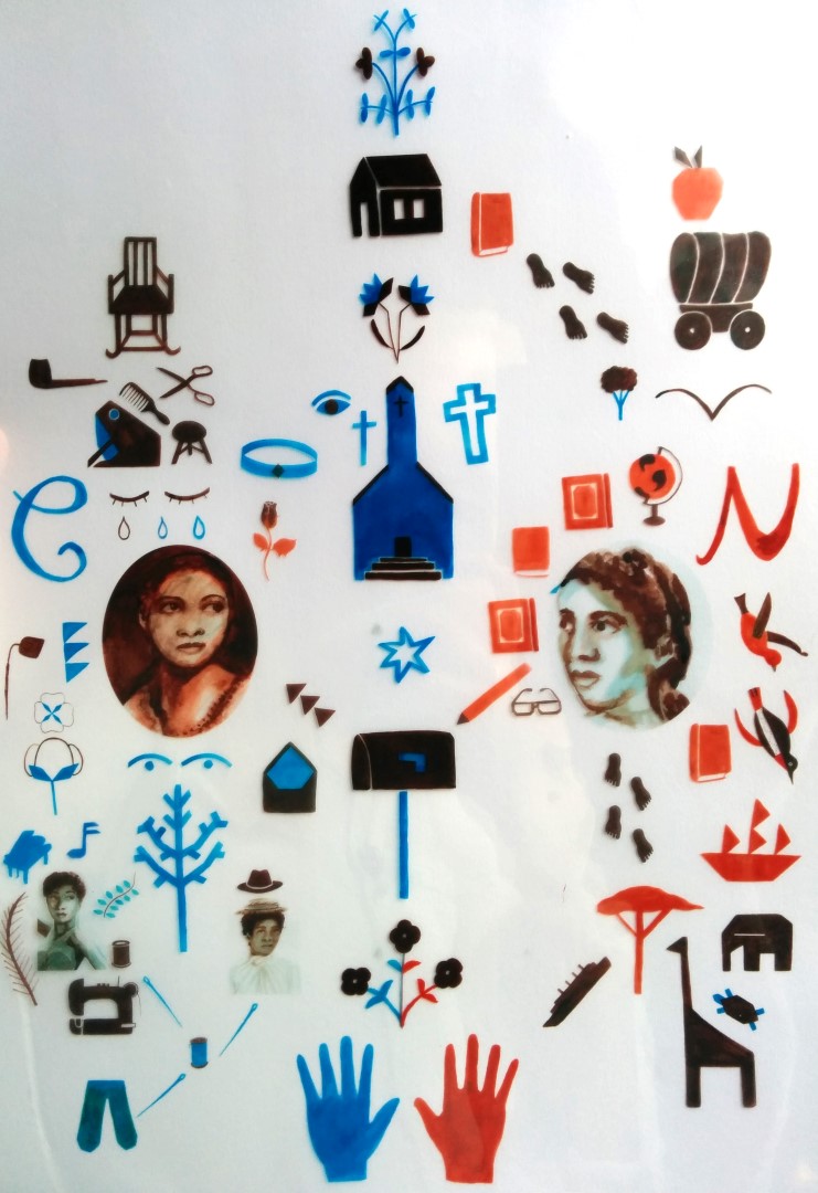
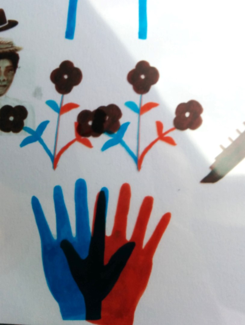
For this I have been focusing on the composition, scale and structure of my images and actually looking back on my dissertation on The Narrativity of the Frame to help with this. The image below is what I came up with at the end of last week.
I felt like this was a definite progression from the first quilt and in trying to bring the symbols and portraits together but still had to work on the composition more to direct the eye where I wanted it to go. I wanted to show a real balance between the blue and the red imagery and the blue, almost like a reflection to represent how the two characters are sisters and how they are living their lives.
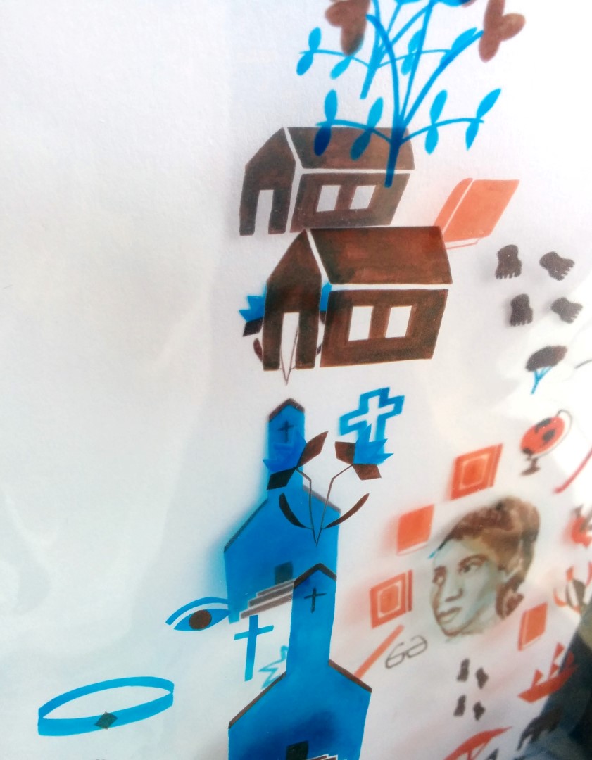
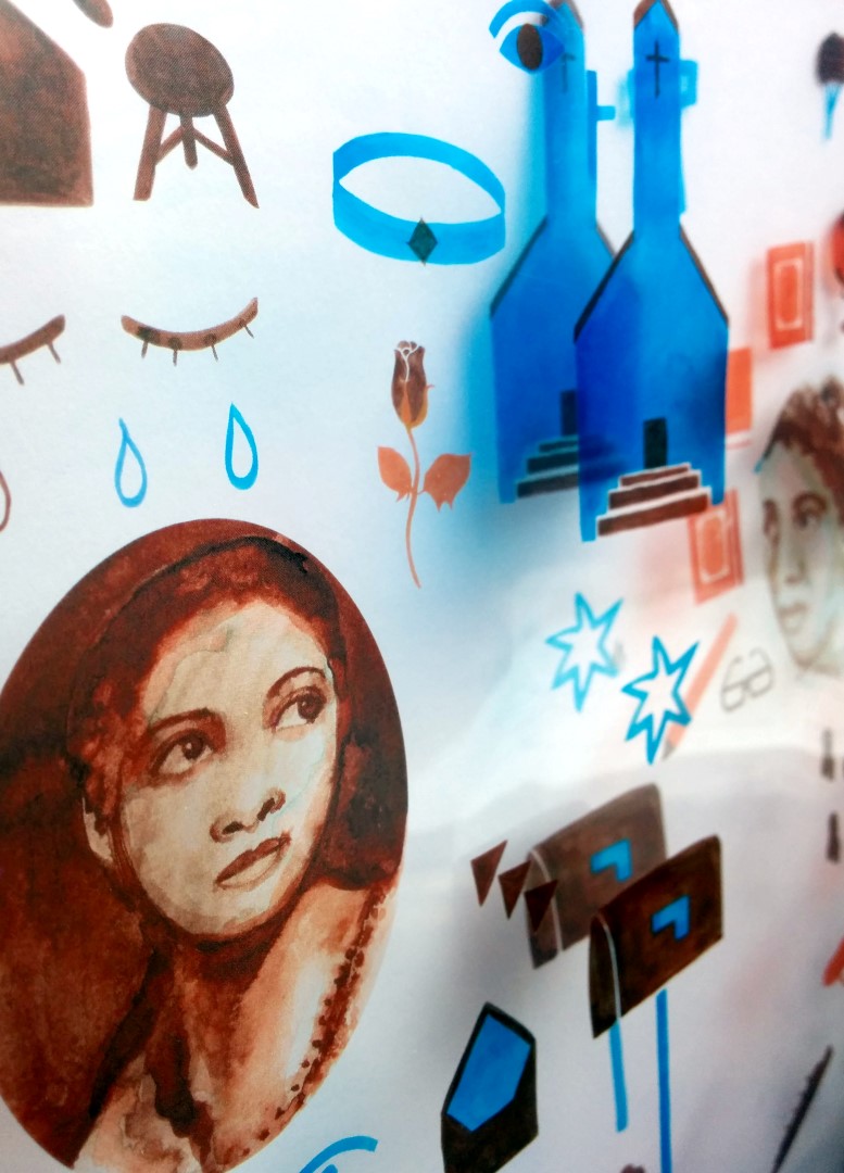
Throughout the week I’d been playing around with ways to arrange the symbols into compositions which add a new level of meaning. To do this I printed out the symbols I had again and cut them up to arrange them easily. A couple of examples of this can be seen below:
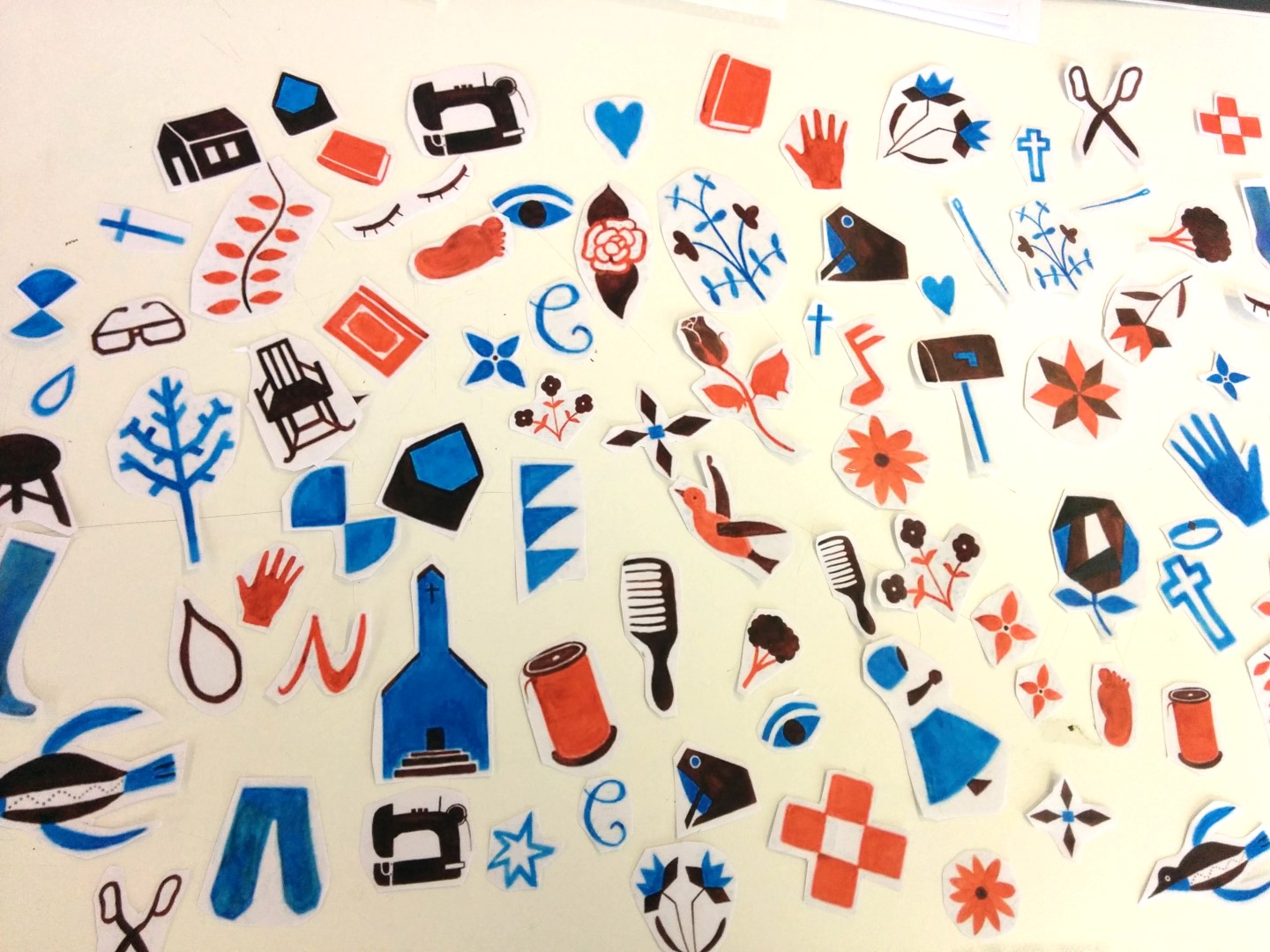
(Cut up symbols – perhaps eventually I can make these into stickers!?)
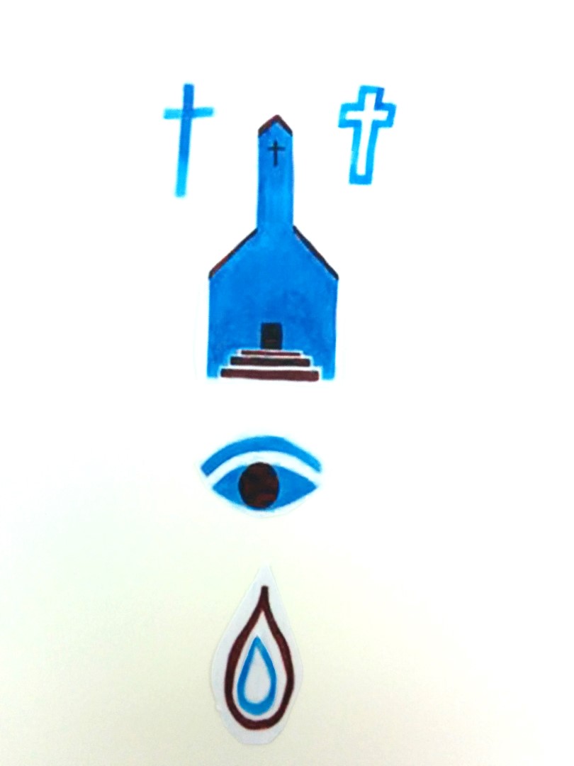
(Above = Celie looks at a boy at church and then is punished for it)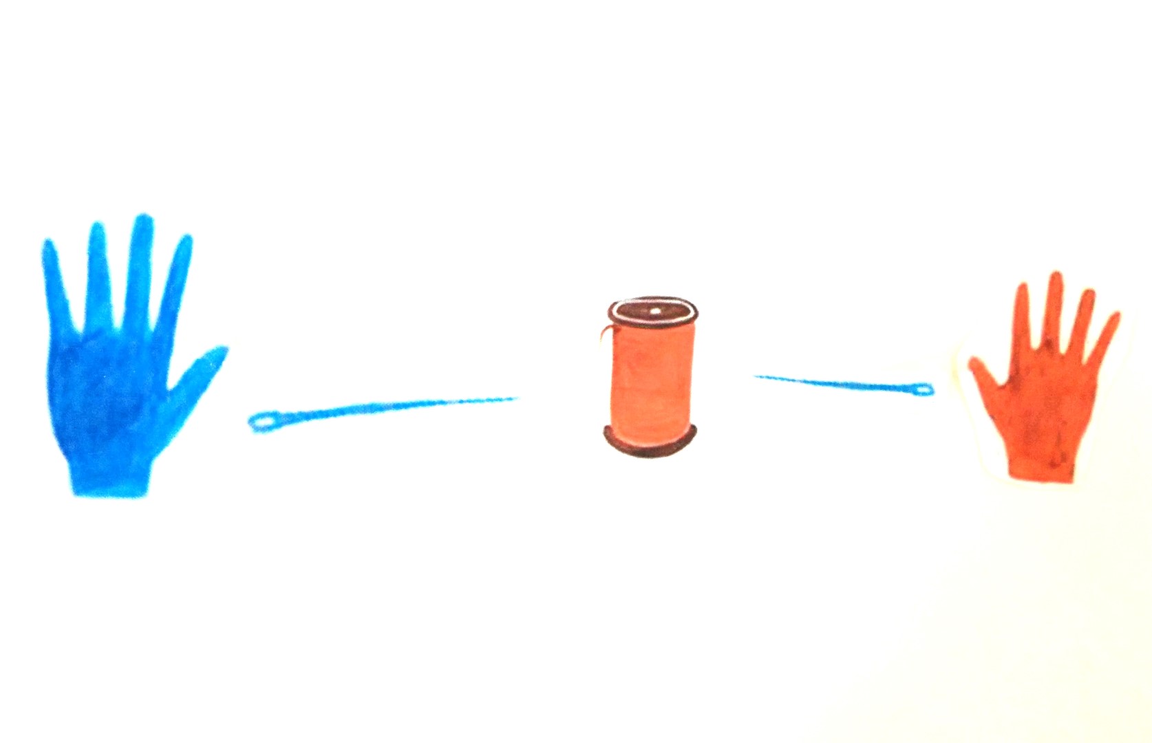
(Above = Characters ‘coming together’ or uniting through the act of sewing)
This thought process helped me when laying out my final composition which I am still developing. With this new found imagery I also had another idea which I visualised at the end of the week. I printed off the symbols for Celie and Nettie onto acetate and overlayed them: When Celie and Nettie come together their narrative and identities are complete which is what I hoped this would represent. Some images of this can be seen below:

Where the images are the same on both layers, these are symbols / images which connect the two characters.
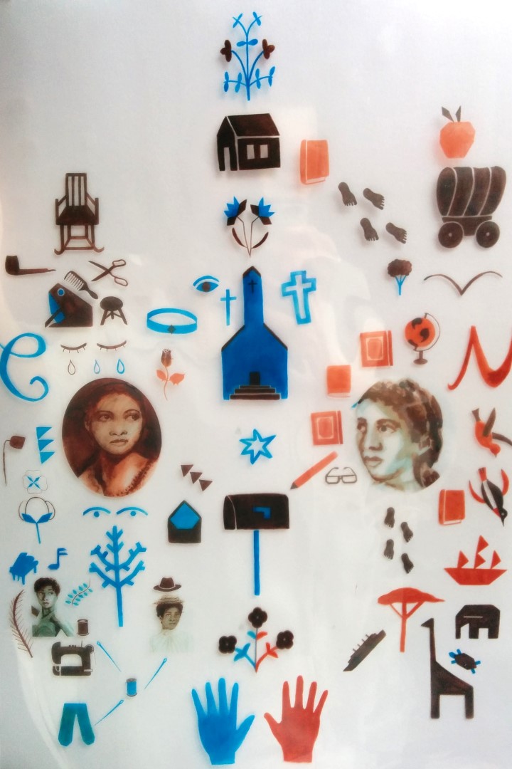
Finally, after this experimentation I rearranged the imagery even further, spreading it out even more at the beginning of this week. I did this to the scale of the boards for our degree show (90cm x 200cm) and even though I may not need to print it out at such a large scale, I think these proportions work a lot better than the image before. This new layout is seen below and is where I am at with the imagery so far.

This is the point I am at as of now. In regards to my graphic design collaboration, my part is pretty much finished with that, all imagery has been finalised and given to my partner and I just have to create one more cow. In regards to my ma application progress, my personal statements have been given the go ahead by our careers advisor at uni and they are now in the hands of my tutors, and I was actually able to send one off this weekend!
Today I had a tutorial with Glyn and we spoke with Gina Cross in regards to self promotion: both experiences were really helpful and insightful. Gina’s advice on my portfolio was to keep everything clean, considered and well presented. She gave me some great advice for my website and actually, I haven’t spoken to anyone about this before. Some key points she made with this were that:
– My ‘logo’ which I created and use on my business cards and CV should be used instead of the current type.
– I need to filter everything down, refining the projects that I have
– I should go back and edit the layout of my images on pages as at the minute each project page is one long scroll of images.
These are things which I hope I can rectify post-hand in and things which I am excited to change! I would also love my body font nunito to be ‘light’ rather than in the ‘normal’ weight it is in now.
Finally, my talk with Glyn was very helpful and well needed I think. I was worried I wasn’t going to get any feedback on this imagery I’d been refining this week as we don’t have crits, but I got a lot of help with this. Without going into detail some key points were:
– Focusing on the overlapping elements (see below) where I can make purple in the images and to experiment with acetate for this as often the combination of red and blue ends up as a dark blue
– More character development: my character images were too ‘cropped in’ and to address character in a similar language to how I did the symbols.
– Possibly consider the texture of symbols: Maybe at key points in the story creating texture within the images which relate to pivotal moments for the character to add deeper meaning? This might not be necessary but is still something I should consider.
– Make sure every image is perfect: crisp lines with colours that are correct and not ‘mucky’ as some of them look on the fabric, make sure again that the images are not generic (random flowers, birds) and have specific meaning. Consider the lines in the images also, maybe adding a tusk to the elephant etc
– I could present the final piece on fabric or even with the acetate idea: Both bear risks in the quality of print however.
– Instead of embroidery hoops of a set of separate images I should just focus on having a book and a final printed fabric / acetate piece which is a silent narrative of images with a blurb explaining my thoughts. I think this will be great as a way of explaining my ideas and process behind the imagery, and showing people what I saw were such clever and interesting literary techniques in the novel.
– Need better portfolio and an archive box for developmental work
And that is that! As of now I am going to create a new, updated and in depth to do list and crack on with my tasks. Finally, below is a rough time plan so far:
WEEK ONE: Refined large scale image, sent it to print
WEEK TWO: Work on Book, refining this and printing this
WEEK THREE: Portfolio, annotation and mounting!


