
BA8 progress after 2 crits
Unfortunately it has been a while since I have been able reflect in detail on my progress and learning so far. Thankfully I have made a lot of progress in the past couple of weeks I feel!
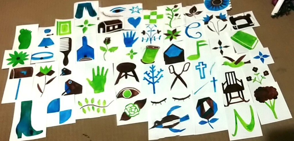
The image below is from almost 2 weeks ago or perhaps less where I laid all my work out so far in the order I completed it. At this point and looking at pretty much all of it spread out in this way, it was still quite scarce. I like to lay everything out and work out of the sketchbook so I can see everything in this way, and see a progression and development of my ideas. This also helps when considering how to lay out my portfolio.
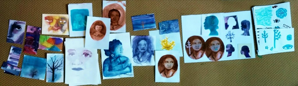
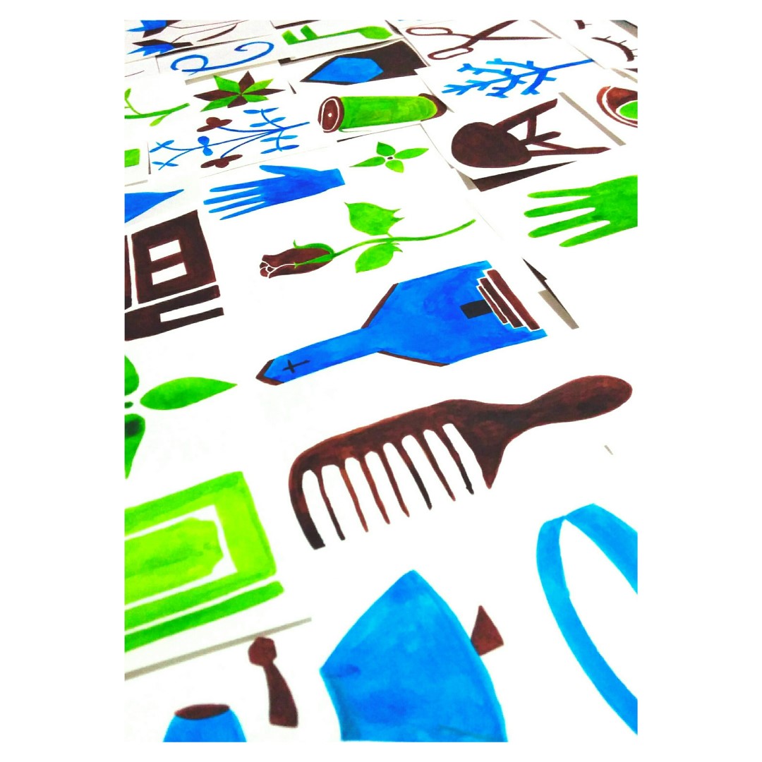
So far I could see two common similarities in my work. The use of portraits and faces and the use of symbols / symbolic images. I decided to try and push both a little further. Since the photo above I have done more painting to try and refine the imagery of the faces and pushed the symbol idea a lot.
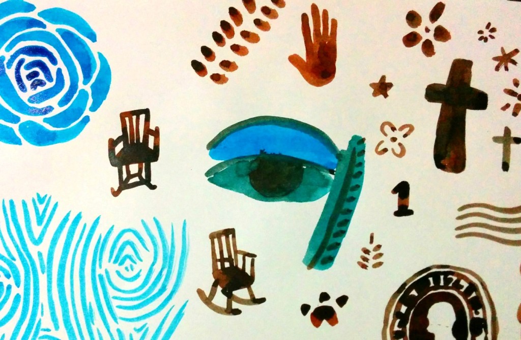
The image above is a very rough initial idea I took to a crit with Peter on Monday 10th March. Focusing on Symbols appealed to me as it’s a natural link to a very important symbol in the story – quilting. I thought I could create symbols which are aesthetically similar to ones in a quilt and combine these with the portraits I’ve done rather than creating a literal quilt. In simpler terms, creating imagery inspired by elements of a quilt rather than a literal quilt.
I had done a lot of reading into Alice Walker and the story’s context and was really interested in how the story is constructed in a similar way to how a quilt is constructed. For example, the story is written in an epistolary manner in letters. Separated, these letters wouldn’t make sense but read together, meaning is created. Similarly, patches of a quilt are brought together to make meaning. This is what I have been focusing on so far.
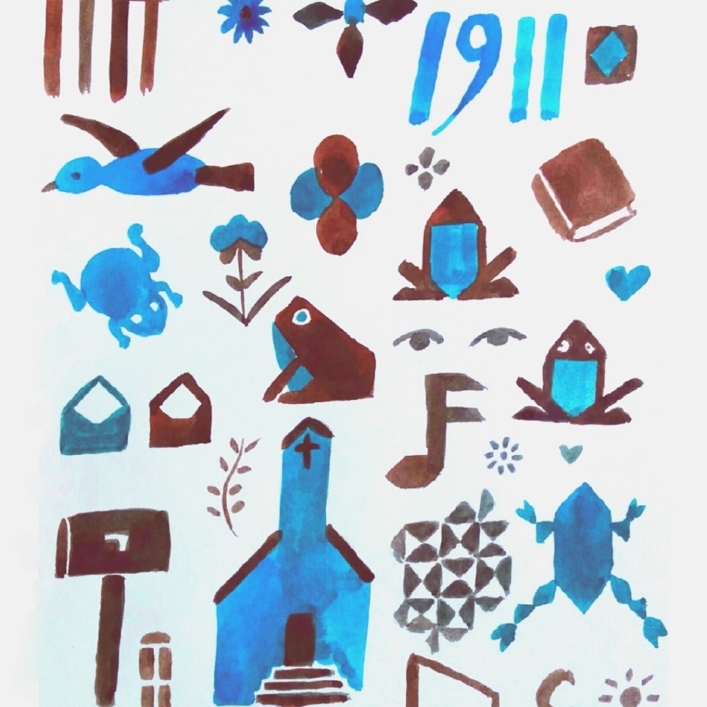
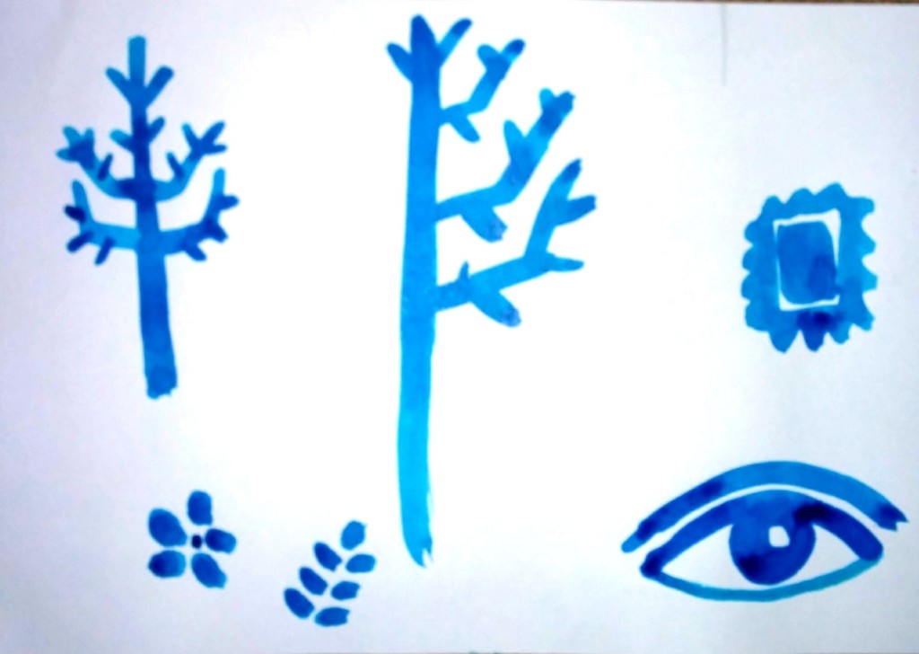
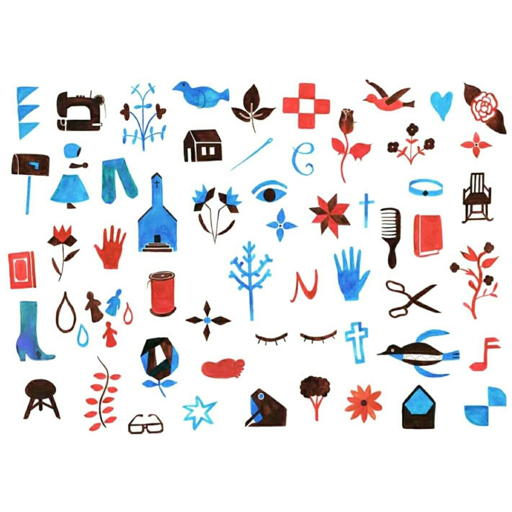
The images above are of the first symbols I created. I meticulously went through the story, identifying symbols and key events in each letter! These images are based on these findings. I took these to a tutorial with Peter two weeks later my last crit as I had unfortunately missed the week before’s as I had been ill. I was feeling pretty behind but a little relieved that I had created a lot of symbols and really deeply analysed the story. Peter liked the imagery and the fact I had used only two colors. He suggested I start to refine these images even further, painting them on a larger scale and making them sharper with varying line weights, using different paintbrushes etc.
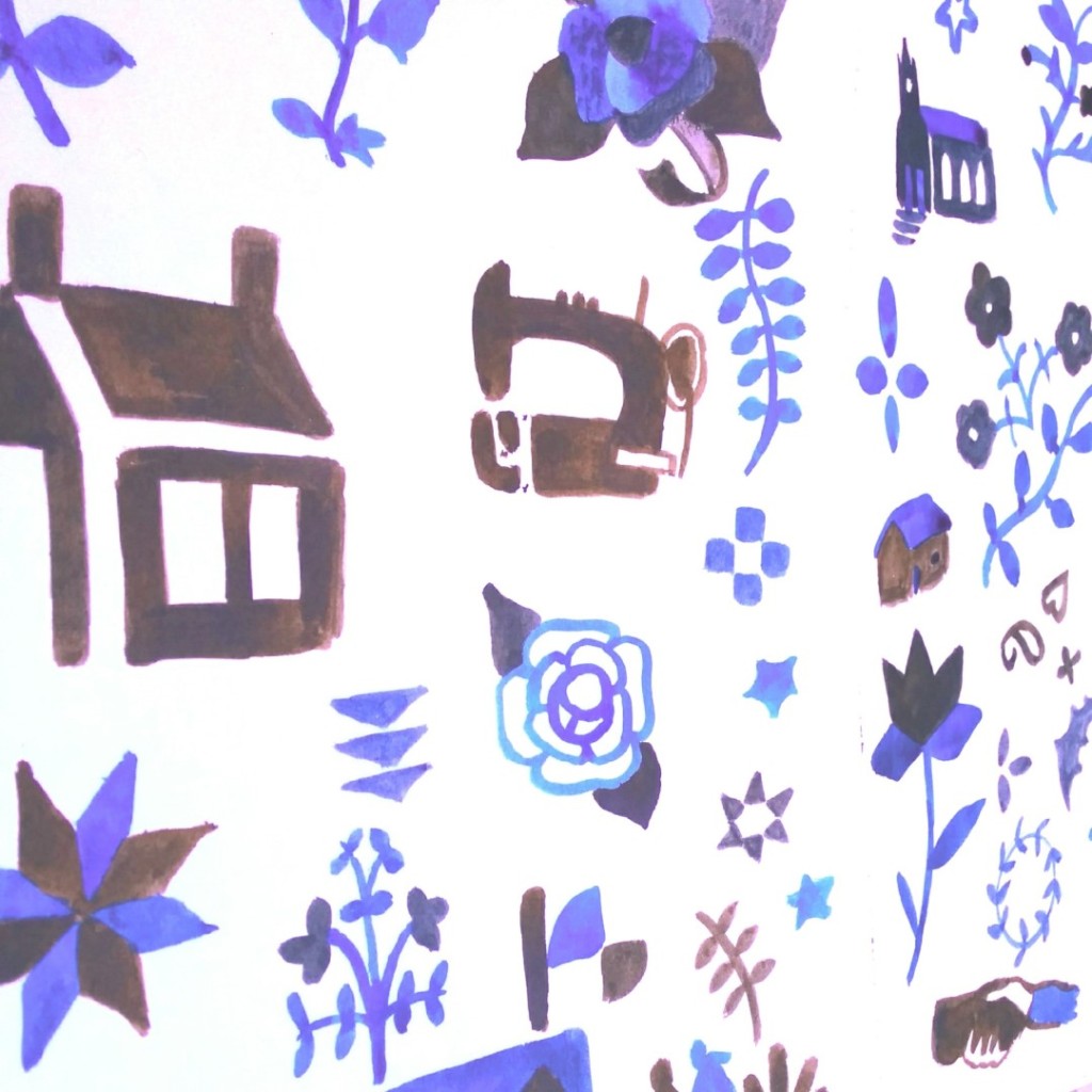
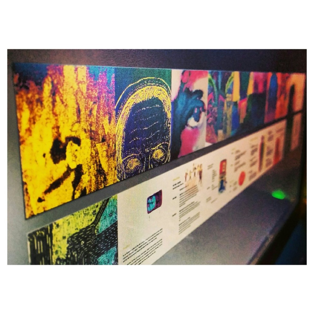
A week later, the photos above are of all of the new, refined images I created- filling an entire sketchbook! I scanned these images in and laid them out ready to be printed on fabric. When I spoke to Peter the previous week we agreed that it would be a good idea to stick with 2 colors- a color to represent each sister in the story. Initially I chose green and blue. When I assembled the imagery together on photoshop, I realised that an even better idea would be to use blue and red- colors which when overlapped will make purple!
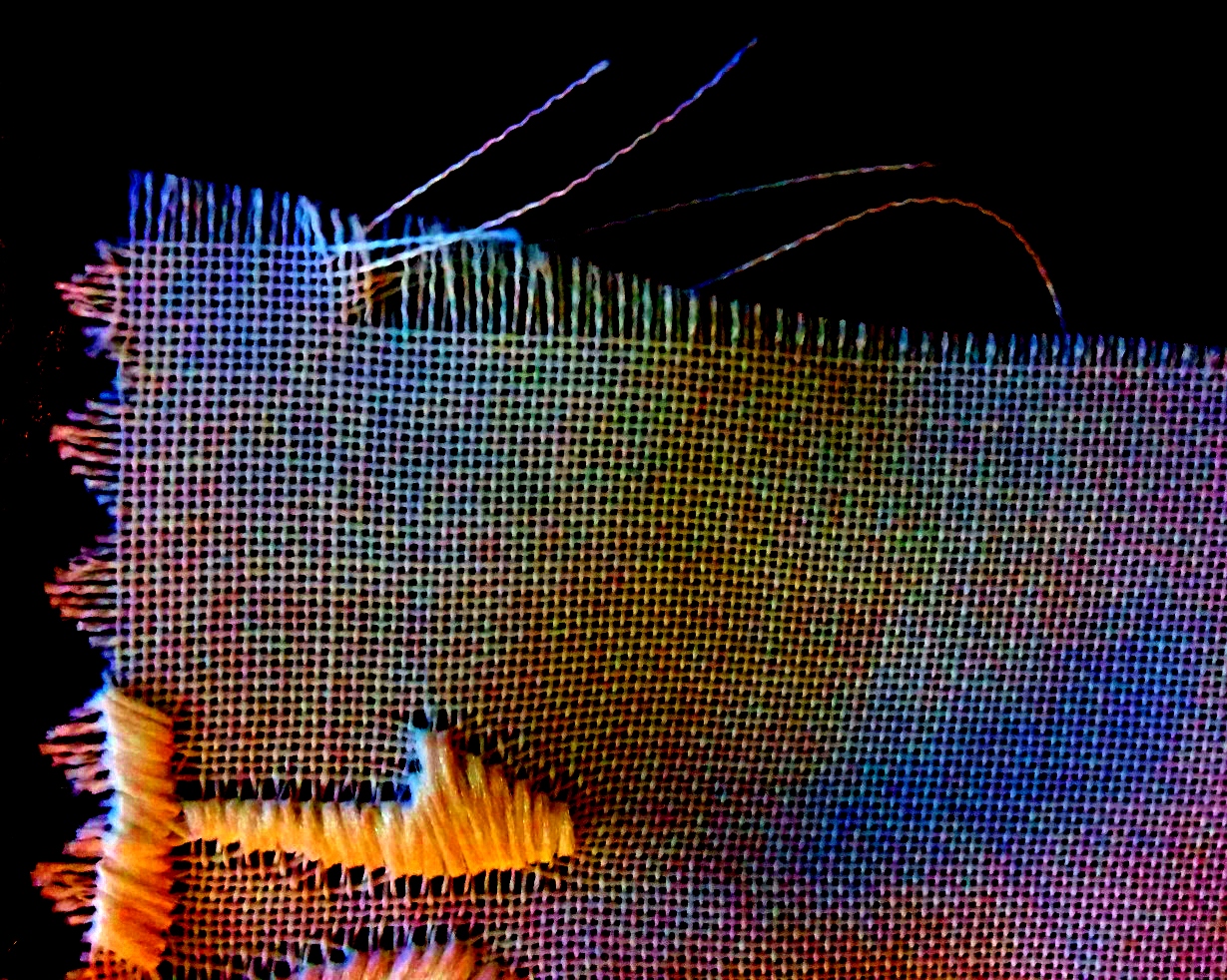
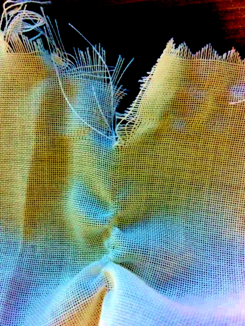
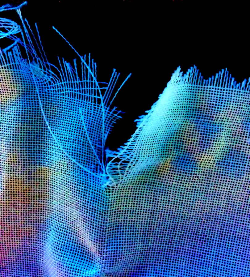
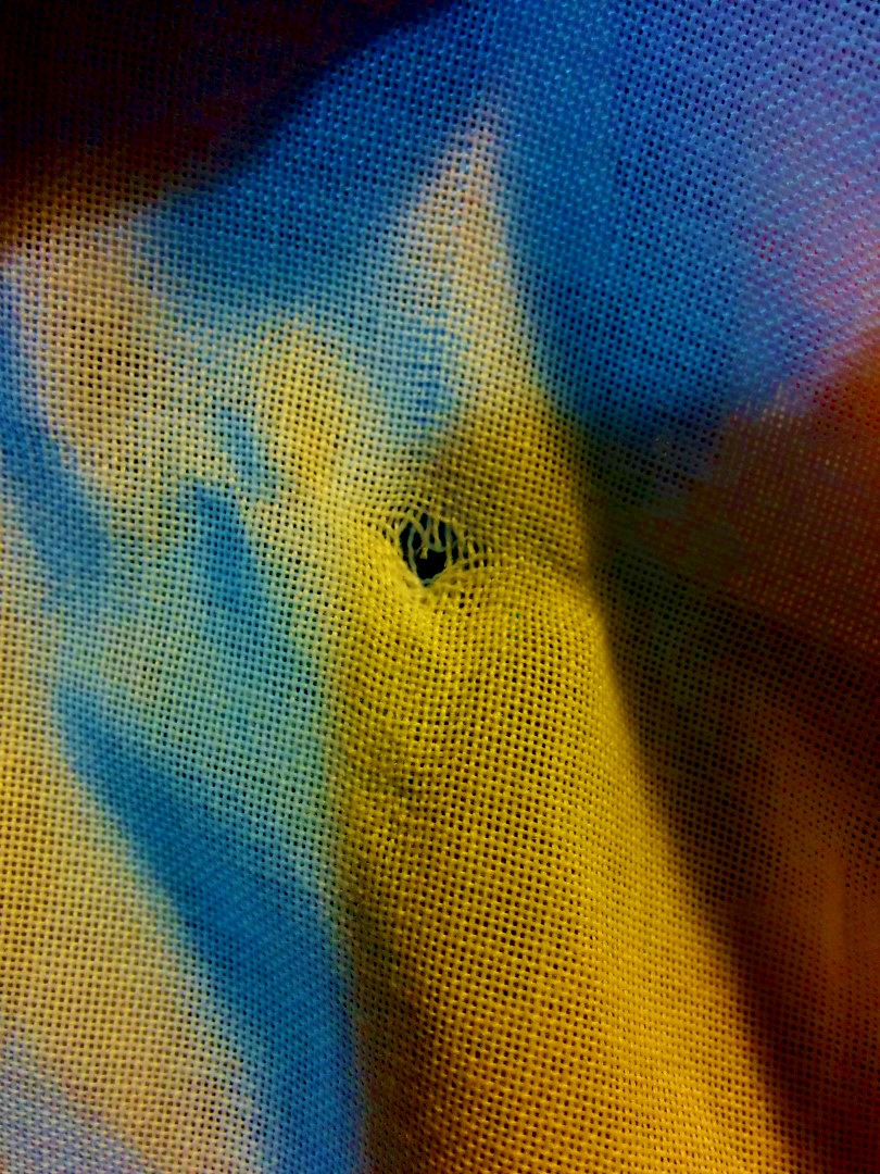
Overall and at this point, the image above is where I’m at. Tomorrow I will collect my fabrics from the print room ready to stitch into and manipulate. Peter suggested I look into an artist- Diana Molzon who manipulates foundations of the canvas to convey meaning. I hoped I could try this in terms of a quilt, perhaps in the material itself, the quality of stitch and the way the patches are sewn together. Molzon’s work is all very different but it all revolves around a canvas. Again, I hope I can do the same, or try to with elements of a quilt. Below are some initial experiments of me ripping into some material and examining the tears. The Color Purple is a story where ‘torn’ is a word used a lot: characters being torn apart, lives being torn apart and literal elements being torn apart and bought back together to create something new. When my fabric prints I hope I can experiment with this further.
In the meantime, I’ve made my creative cv (see below)
And started labelling my work EARLY rather than in a last minute mad rush in the early hours of the morning before hand in. (see below) This is all hand rendered, scanned in, altered slightly and printed out. I hope I can make stickers in a similar manner if necessary for my portfolio sleeves.
In conclusion to this blog post, I am feeling much more on track than ever before. I have a clear idea of what I need to do, a time plan for easter and a visualisation of what I hope to end up with as a final product! At this point I’m imagining a fabric piece, possibly laid over a rocking chair as main character Celie often sits and sews/ quilts. Alongside this I hope to create sequences of imagery conveying character narratives and possibly show how my imagery can be applied to book covers and other promotional material for the book or even musical. As I’ve only had this one main project I’d really like to make the most out of it. Over Easter I’ll be focusing on developing my imagery to the best of my ability and bringing everything together after! The idea I mentioned is only a rough one for the degree show / my final outcomes, so until then anything can still change. Finally, if I have time I’d like to do a ‘mini project’ focusing on my authorial approaches and materials as well as finishing my work with my collaborator on Graphic Design, creating imagery for re-branding Pilgrims Cheese!


