My Final Piece!
This week and last week has been an incredibly stressful week in pushing to get my final piece perfect for the fabric printing deadline which was this Tuesday. I spent a long time making sure the piece was right and it went through a lot of changes but now I think it is up to my standard and it has been sent to print. Unfortunately and very annoyingly, it’s highly likely that my print won’t be ready for hand in (next Friday) even though the Tuesday print deadline was a guarantee for getting the fabric back for next Thursday, so I have sent the print to be printed digitally also at a0 as a guide, even though I think the final thing will be bigger than that.
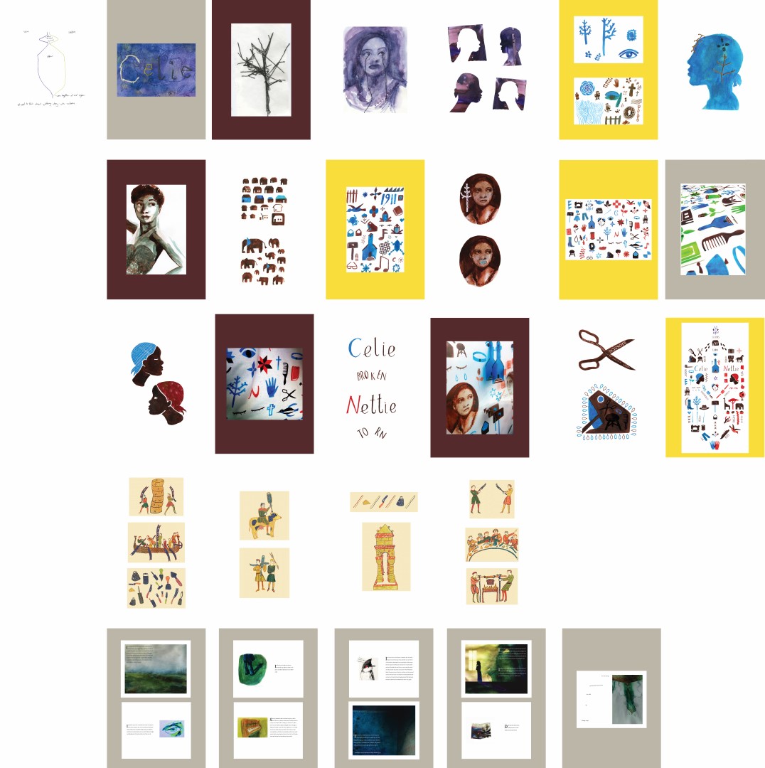
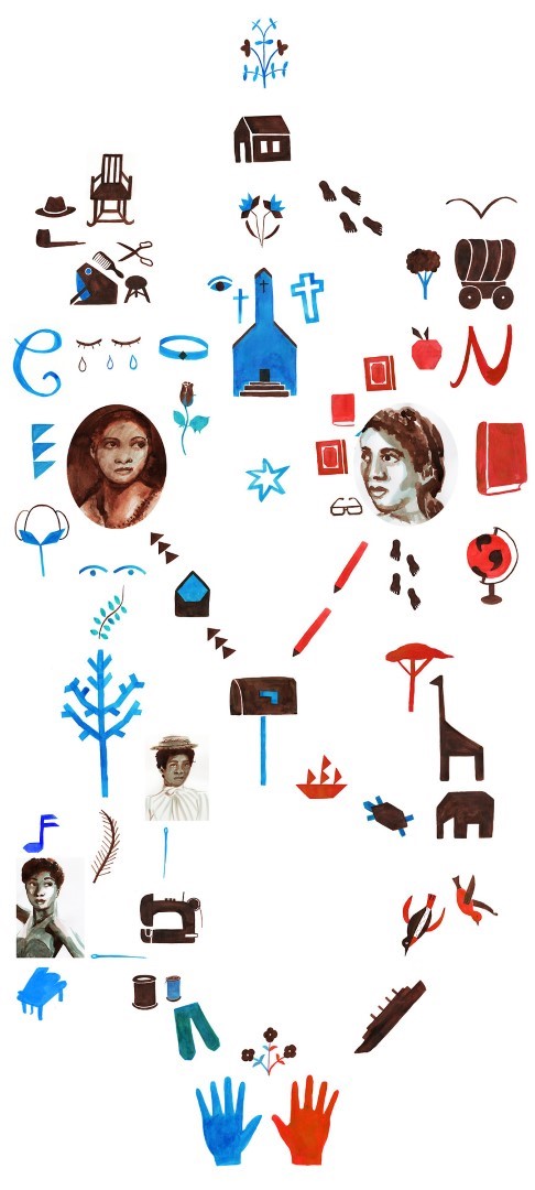
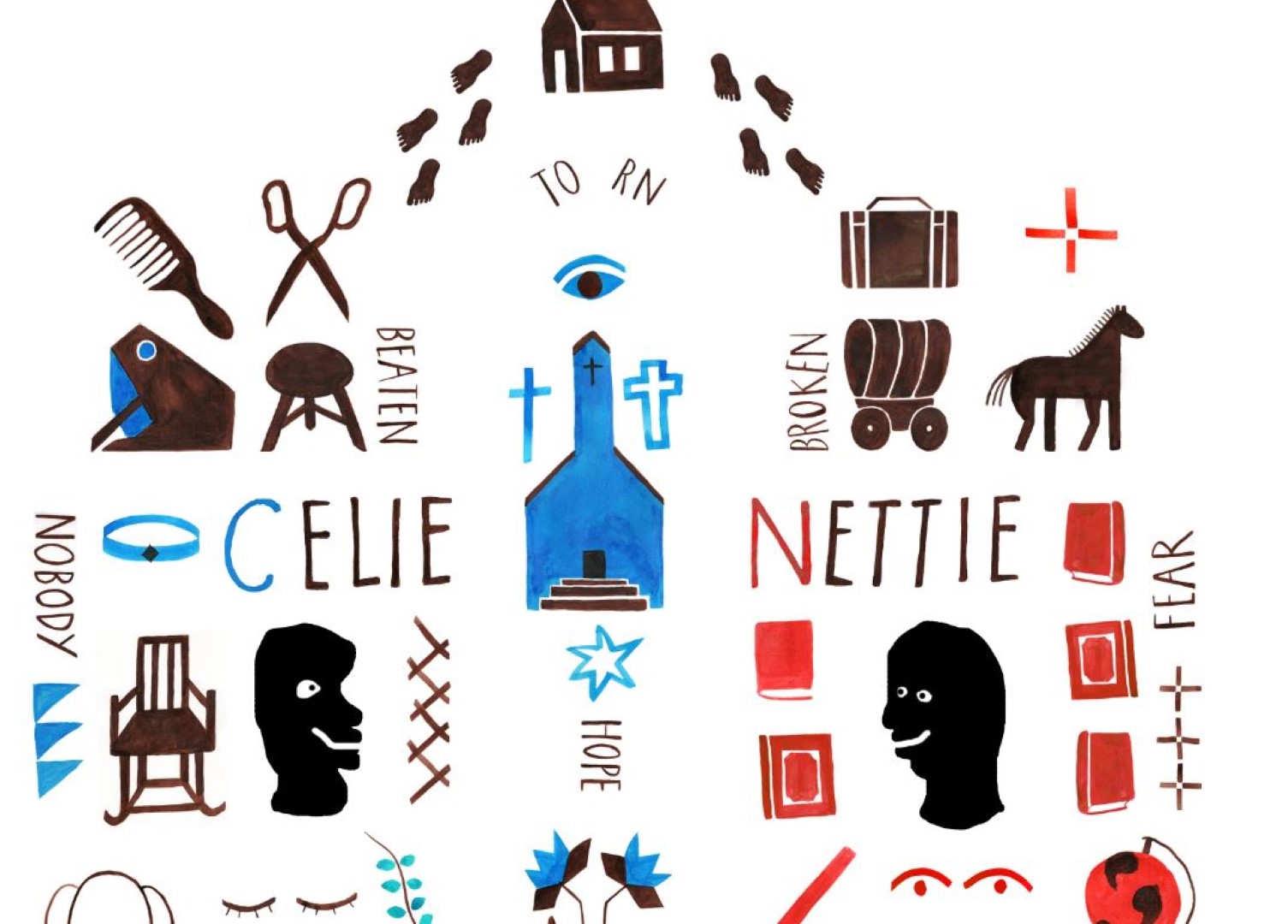
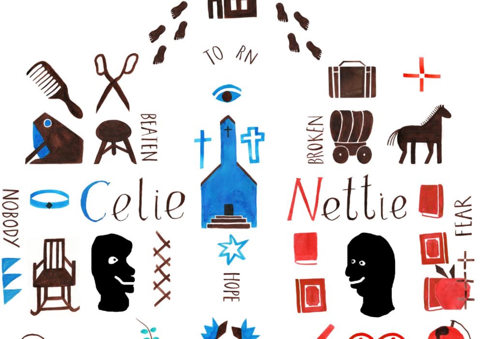
Below are some photos of the print to scale which I roughly printed and assembled using a4s to get an idea of whether this size would look too big before I sent it off on the fabric.
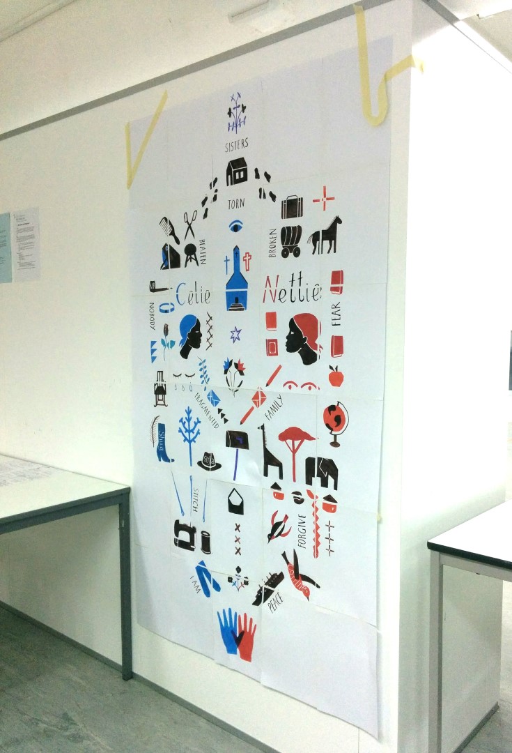
When I first assembled the piece I thought it was going to be too big, but on the wall and roughly a little smaller than the boards we will be having at the degree show it seemed to fit and be a good size, not too big or small. It seemed big enough to see from a distance and small enough not to look overdone. I was discussing with Peter how I could hang the print and I don’t necessarily have to have it hung against a wall and it could be in the middle of a room which would make it feel more like an object. I hope to use blue thread on the left of the image and red on the right side to create a border and neaten up the piece which I look forward to doing as I think it will add a nice finishing touch! I’m excited to see the print on fabric and really really hope the textile print is done before hand in as that’s how I want the piece to be seen, not flat as a print on paper which is a shame.
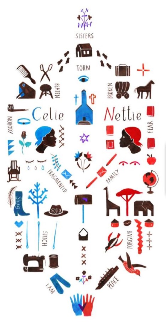
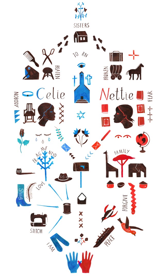
Despite these stresses of printing I am happy with the piece and am pleased I spent a lot of time on getting it right. It’s nice to see a development of the composition from beginning to end and nice to see how much better it looks now I think! Since my last blog post I added some text which were also fragments of the story. These words I hope will act as a subtle guide along the story and hopefully say something about the narrative. The work of Jeff Fisher was a great inspiration for this and I think the addition of text emphasises the fact the piece is a narrative from top to bottom rather than a decorative piece in response to the text.
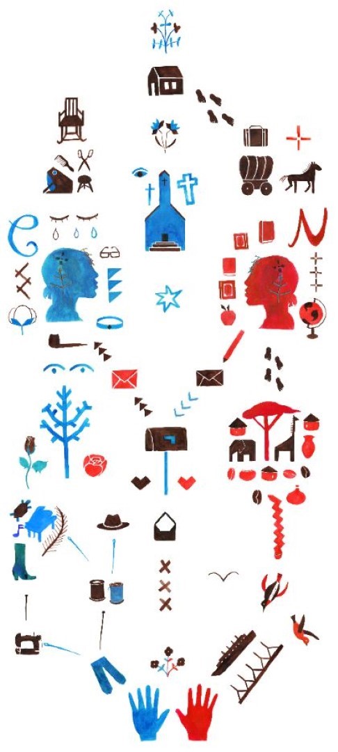
In a future post I hope to provide my project summary evaluating my piece and my work for my other 2 smaller side projects rather than evaluating everything now and repeating myself in the project summaries. Below are some more images of the progression of my piece:

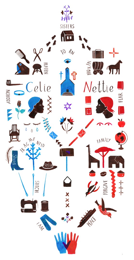
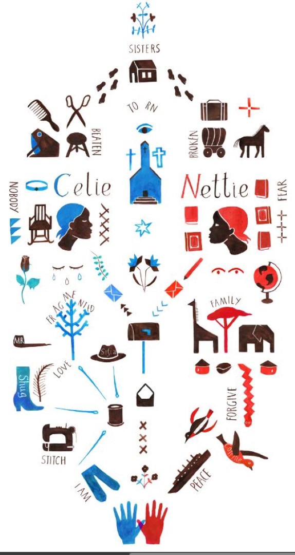
And below is the final piece sent to print!
I hand painted all of the type as mentioned and below are 2 different types I had to decide between. In the end I used a more ‘hand written looking’ type for the character names to contrast with the quotes and because I thought they had more character. I was pretty happy with this and think they look a lot better than before where I just had a C and an N.
Finally, I’ve sent my portfolio to print which I am also looking forward to. I will be mounting my side projects separately and printing my ‘The Color Purple’ project on good quality large format printers.