The first year of my MA in Children’s Book Illustration (Cambridge School of Art, ARU) is complete!
Indeed, my first academic year as an MA Children’s Book Illustration student has come to an end already! It’s been a long and somewhat confusing term but I have learnt so much, and so much over the course of the year! To think that before I was on this course I hardly did any observational drawing outside life drawing is crazy. I have learnt so much, so much about drawing, colour, composition, sequence, perspective and what makes a ‘good’ image.
This term, as possibly mentioned in previous blog posts, was titled ‘The Sequential Image’ with the aim of creating a sequence whilst developing and experimenting with ways of working to create a personal voice. Some things I had hoped to achieve this term were:
- Improved Perspective
- Lots more drawing of People
- Continued exploration with media and materials
- Lots more actual drawing (rather than painting)
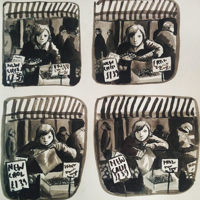
And of course aiming to create a sequence. Last term I did lots (6 sketchbooks full!) of drawing around Lincolnshire and really enjoyed the imagery I created whilst at Boston Market. I felt like I was really getting somewhere here with my illustrative voice and use of materials and decided to create my sequence based on this eventually after lots of encouraging feedback from others. I’ve included a sample of this below.
When I started off the term in January I created the image below. I was a bit confused at the beginning of term as I was advised that basing the sequence on the market was too specific, so I spent a while debating on what to do!
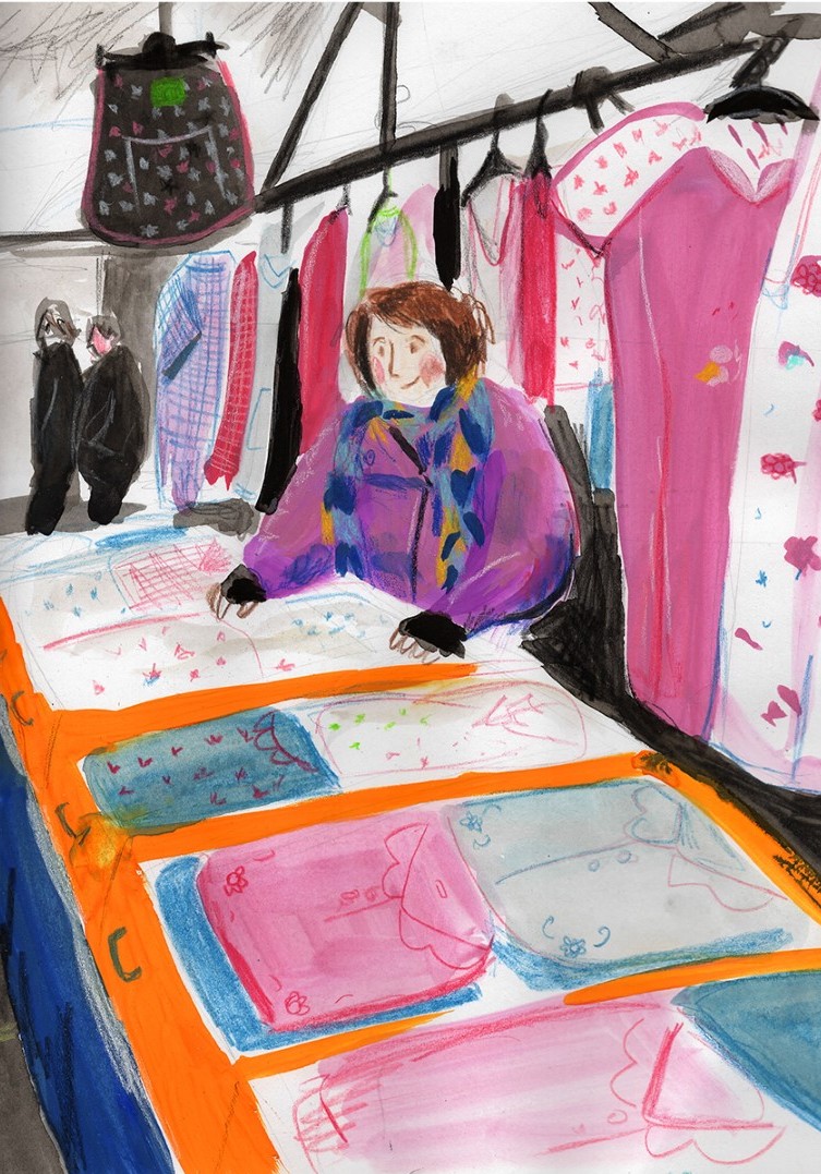
Eventually, after ranging from a theme of ‘buying and selling’ to ‘exchanges of objects’ to ‘a cat exploring a market’ to ‘a day in the local market’ to ‘a day in each market stall’, I decided to really narrow it down to ‘The Setting up of a Market Stall’ and decided to focus my work on one stall, a ladies nightwear stall which was full of colour and pattern.
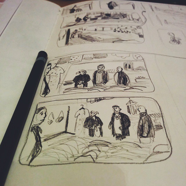
I created dozens and dozens of little thumbnail images from observation which as drawings actually turned out pretty good despite their size! Throughout the end of the term I was faced with the issue of how I would reproduce the images, how they would look in a book and how would I use colour.
The image above shows one of the first attempts of mine to re produce the thumbnails as finalised images and admittedly I was pretty happy with this at first. However, when I took this to a crit a few things were pointed out with it which were bad; that there was too much going on, too much colour and I shouldn’t be using black. However it was said that my character was nice and the shape of her was nice too. The lesson learnt here was that I shouldn’t go into too much detail or overload the image, and remember where the eye should be drawn to and ultimately what I’m trying to say (the basis of illustration?!). Anyway, to be fair, the image above that I have included doesn’t show the full illustration so perhaps looks better zoomed in. A final version with less detail and a more ‘rough’ feel can be seen below.
I think next term and certainly over the summer I will have to be thinking about my ‘voice’ and just keep practicing making illustrations I think, as looking at these images side by side now, there are aspects of the first which I do really like that lack in the second. It will be interesting to see what my feedback will say about this which hopefully I’ll see in a few weeks time! A problem of mine seems to be that I love detail, colour and pattern but I use them too much and each element is fighting for they eye’s attention.
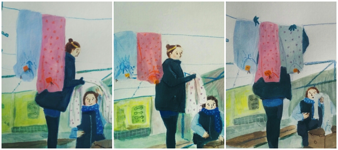
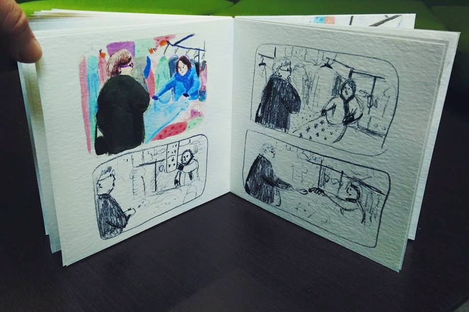
In the last couple of weeks of term I was still struggling with my voice. Well, I say ‘struggling’ but experimenting with different materials, colours and sizes was fun! One of the first things I did was get rid of the harsh black and what a difference that made! The image above is an example of this where I only used maybe 4 colours (a yellow, a cold blue, a brown and a warm red) to mix everything a long with white. When having a crit with just my thumbnail sketches and discussing how to finalise them I think I took the advice of ‘keep the black’ too literally by using the colour. One of the strengths in the thumbnails was the tone and shape which is something I didn’t want to lose.
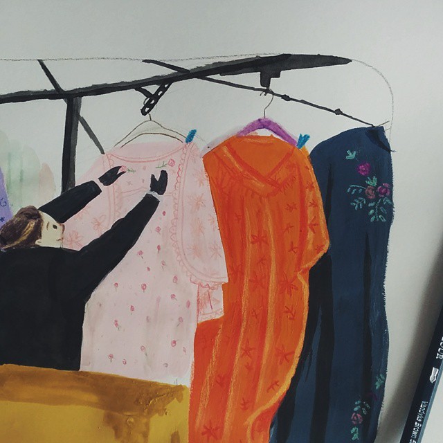
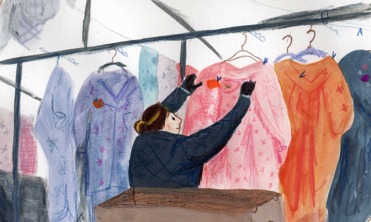
In all this experimentation there are parts which I really like, such as the bottom left of these images above where we see a shop window. I haven’t had feedback on these images so hopefully the characters are the main focal point of the image, but I enjoyed trying to put little bits of detail in as suggestions rather than bombarding the image with details if that makes any sense: so I suppose here where I have included some pencil lines of the glasses on the poster and the tiles. It was suggested to me that I look at the work of Laura Carlin as a bit of inspiration for this, whose work I love!
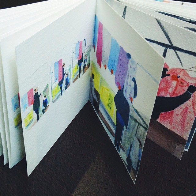
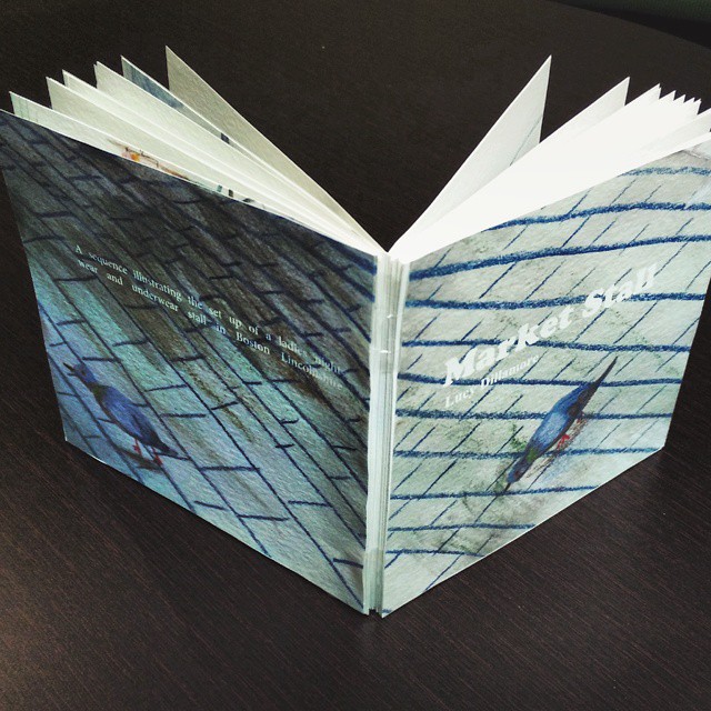
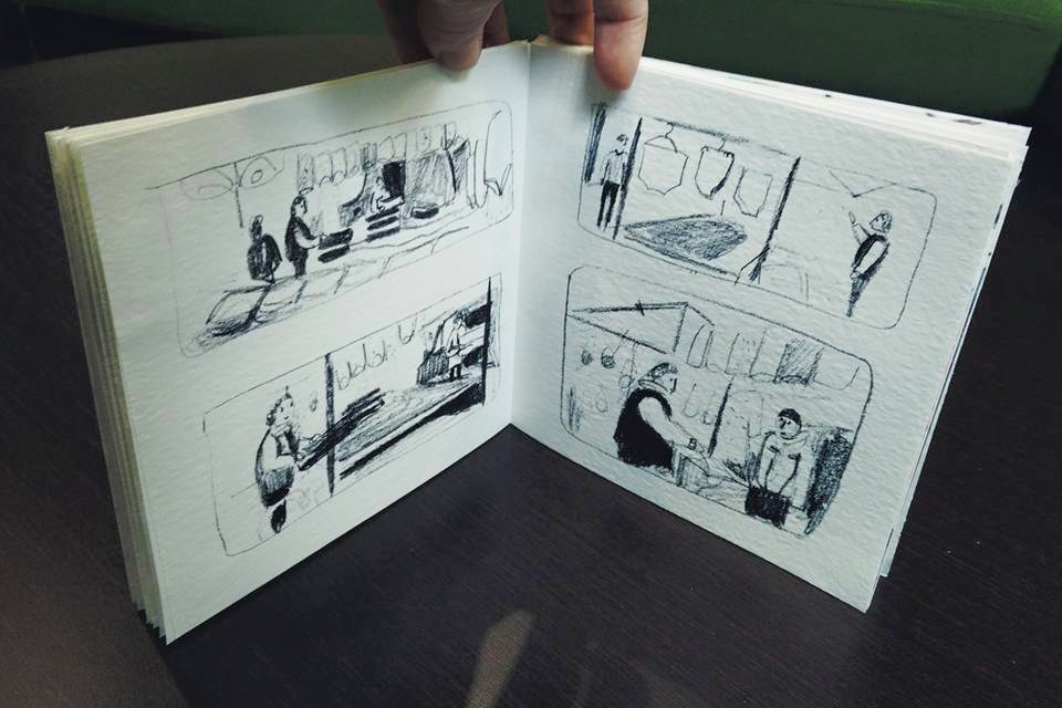
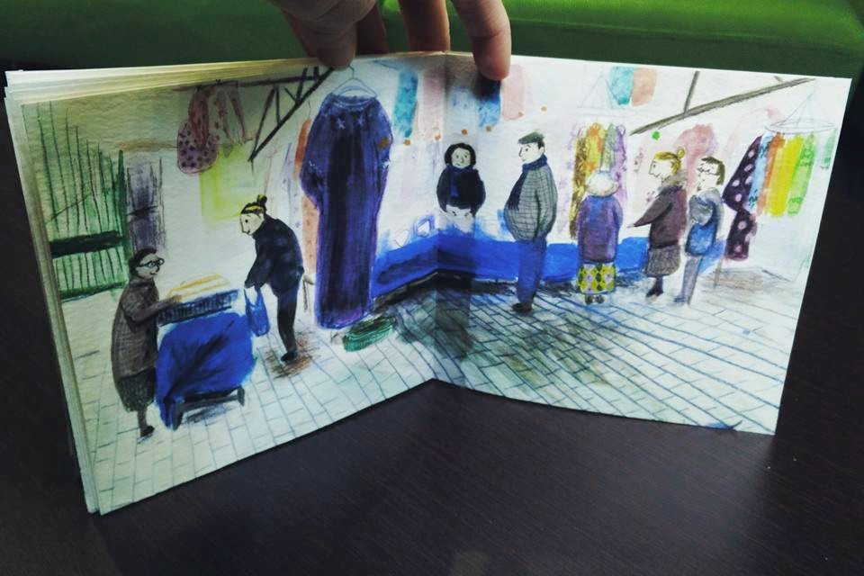
As our time for this term neared an end I knew there was no way I was going to be able to complete the whole sequence in a finalised way. So, what I aimed for was to put a book together with the thumbnails throughout and with the finalised images in there also or the ones that I’d managed to finish. I managed to do this thankfully, scanning in my thumbnails at a good res and printing onto a textured paper and the above image shows an example of my book.
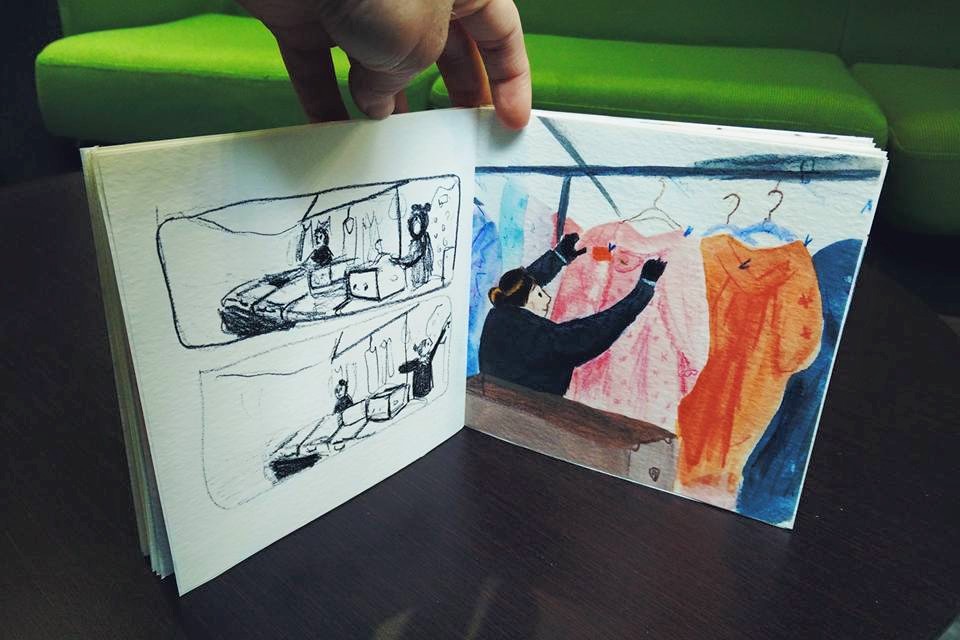
The image above shows an example of this thumbnail alongside final image method which I mentioned. The whole book showed a sequence of the setting up of the stall and was a complete sequence, but the images weren’t all finalised! Despite this I was happy that I’d made a lot of progress in my image making. I think one of the main improvements from last term is that my perspective is a lot better and also my use of tone. Below are some more images of the book I handed in: I will be sure to take better photos when I get it back!
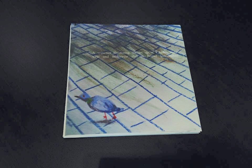
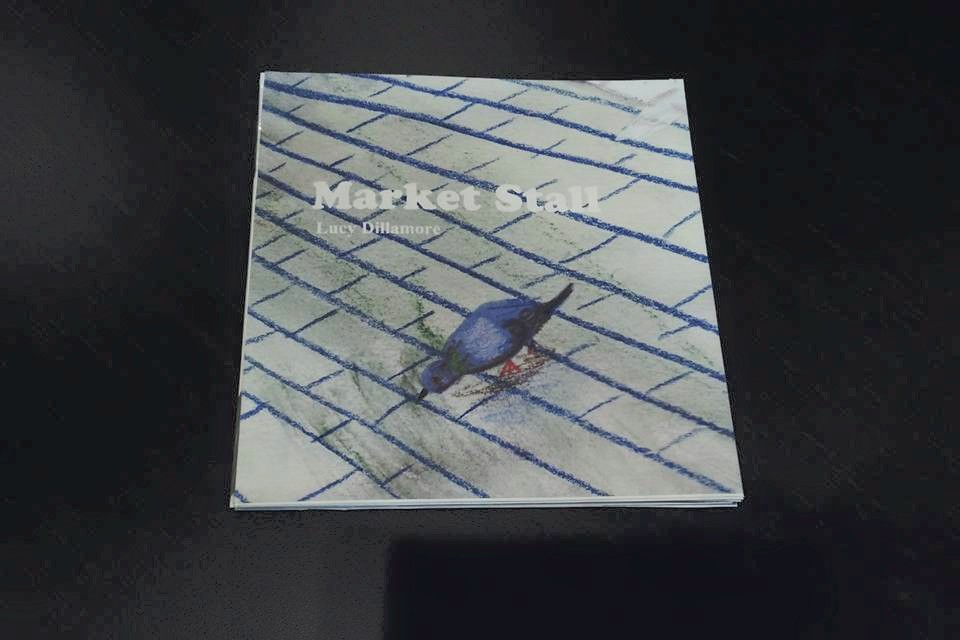
The front and back cover can be seen below. I decided to use an image I’d done already which was finalised but I wasn’t happy with. I zoomed in on this to some pigeons that I was happy with and they fitted nicely on the front and back!
In my final critique of the term on the week before we had to hand in I was left a bit deflated by some of the feedback I’d received. There was a sense of confusion as to what I was going to hand in and why some of the images in the book weren’t full bleed. There was also a sense of disappointment across the room that my work had ‘lost it’s character’ that it had last term, that it was a long sequence and it was ‘just people setting up a market stall.’ This really saddened me, especially as I felt there was a feeling that this was a boring subject matter. To me the subject matter was really visually interesting and I wanted to capture this through my imagery. I wanted to capture the vivid clothes amidst the dull march mornings and the happiness of the women who ran the stall. I enjoy seeing beauty and interest in ordinary and perhaps slightly mundane subjects and I really wanted to achieve this. I think near the end of the term with some of the finalised images perhaps I did. If only I was encouraged to stick with the theme at the beginning of term and I would have been able to do so much more!
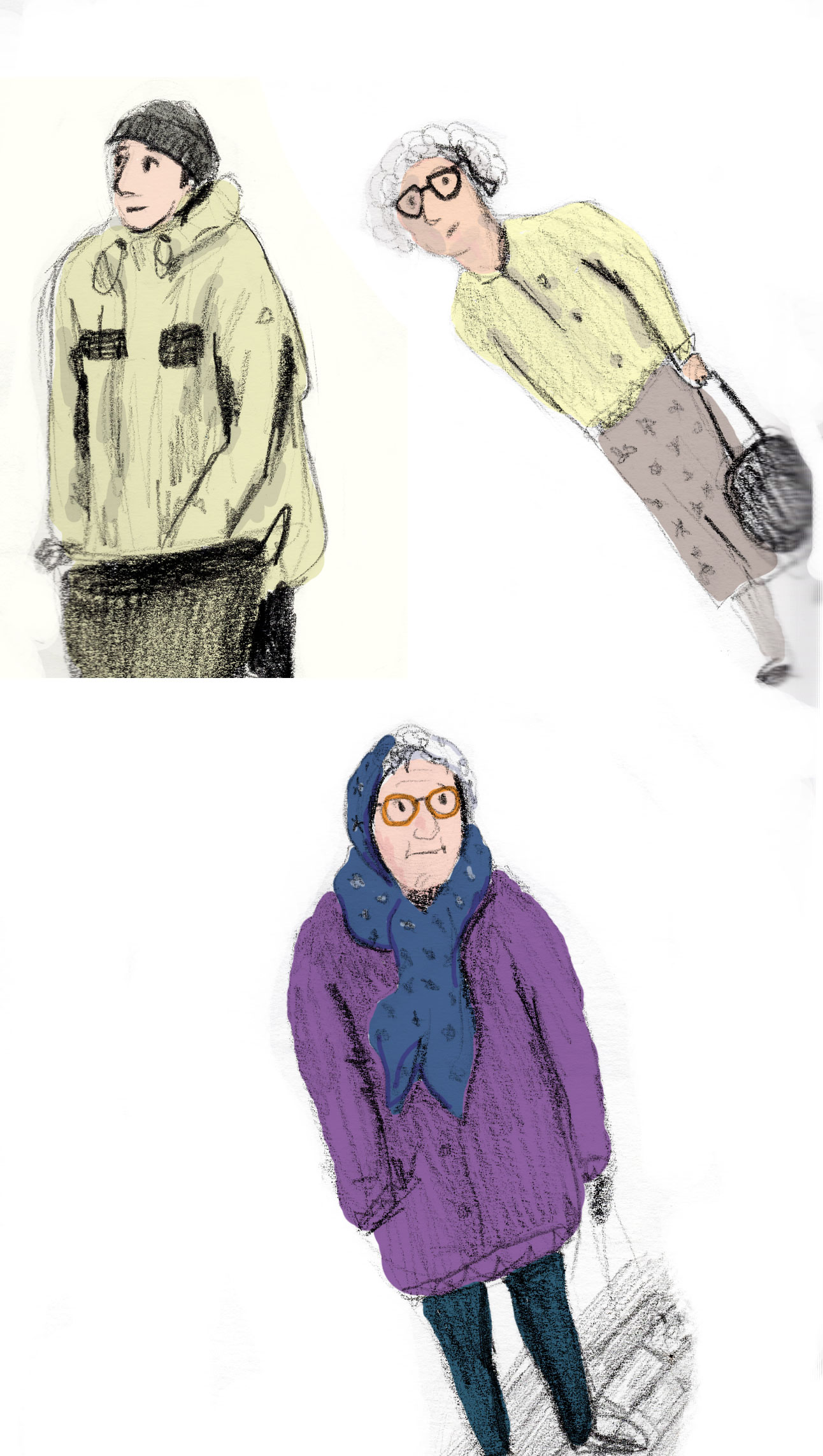
Finally, the image below is where I’ve coloured in some drawings from my sketchbook on photoshop which was fun. I enjoy drawing old people and their clothes! I think the man who helps out setting up the stall and who is seen in the image is the best drawing I’ve done of a person so far this term: not too detailed, not too rough, and with just enough character and no forced eyes or detail etc!
Overall, despite it’s jumpy start and as I’ve said, I am happy with the progress made in colour, perspective, knowledge of what makes a ‘good image’ in general and of course exploring sequence! I hope that by next term I will have more confidence in my own ideas and visual voice!


